22 October 2026
100 Shades of White
A designer shares how to correctly use paint to create an artistic palette.
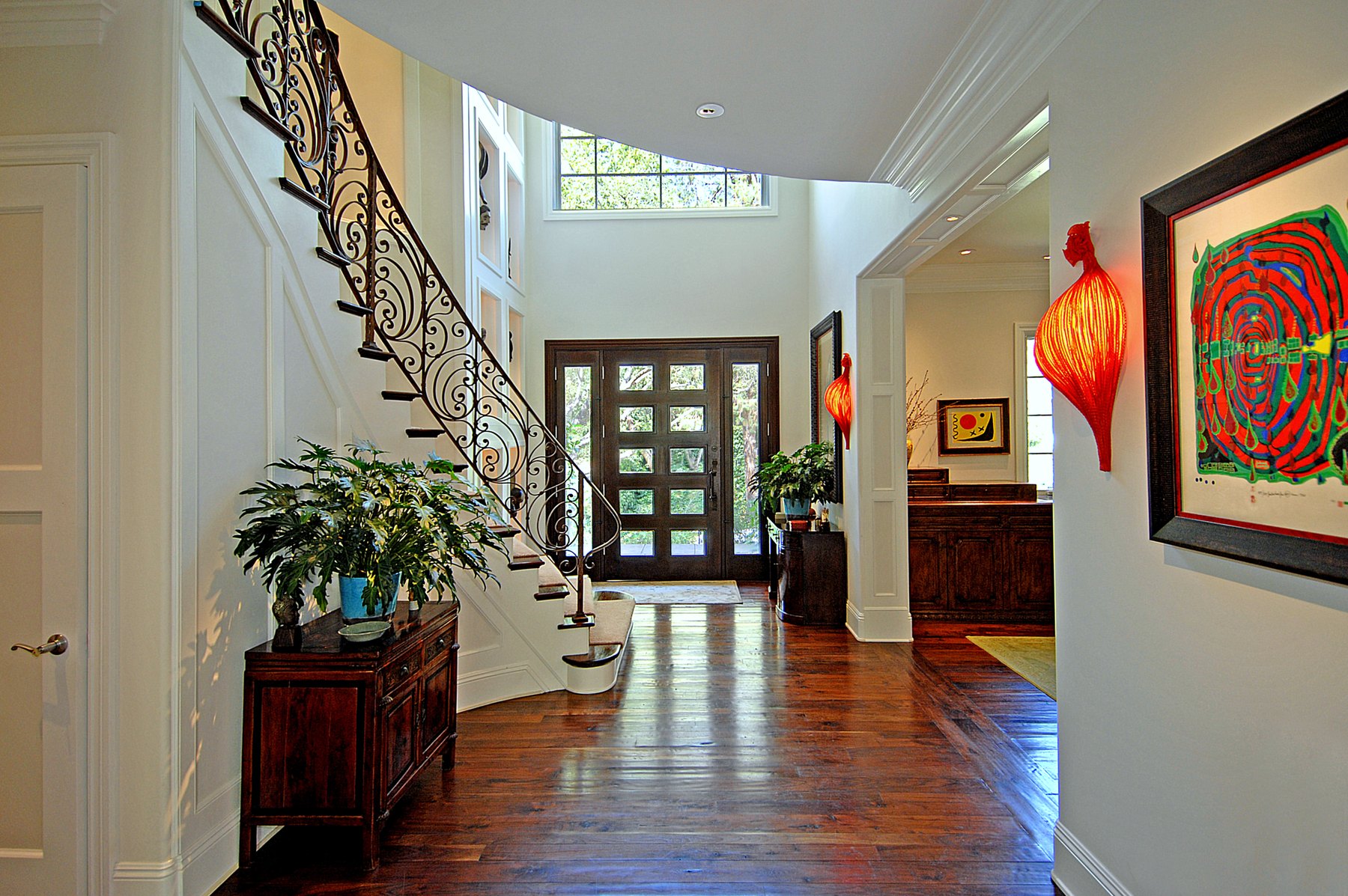
One of the most important jobs we have as designers is to create a light, bright environment for our clients. And we have often heard the quickest, most cost-efficient way to change the look of the space is by repainting it.
As experts we need to be able to explain the art and design of using paint to our clients and teach them how to open up their environments rather than shrink them.
So, what is your game plan?
Put down that color chart! Think carefully, and follow your instincts. The quickest way to shrink the size of the room is to paint the room a dark or primary color. The quickest way to make the room look larger is to paint it in shades of white. I refer to experts who do not know these basics as Decorettes – imposters who desecrate the world of design – and this article is designed to make sure that does not describe you.
Teaching tips
- First and foremost, your client’s artwork and furniture should be the art, not the paint.
- These items will showcase much better in shades of white (there are hundreds available) and lighter colors.
- Defining a consistent color palette throughout the house will keep the eyes tracking through to the furthest rooms, bringing a more open feel to the environment.
- By choosing three different shades of white, you can create subtle art by redefining your client’s ceiling, moldings and walls.
Here are some simple rules to follow to make these tips really work for your clients:
- The lightest white, flat paint you can purchase goes on the ceiling. In many stores this is called “Ceiling White.” This pulls the eye up and gives the illusion that the rooms have more height.
- A medium shade of white paint goes on the moldings, doors and windows and should be semi-gloss. This shade highlights the details in the room while clearly redefining the ceiling and the walls. Your client has paid a lot of money for these items – let’s see them. If your client has a contemporary space, there will be no moldings, so this medium shade will go only on the doors and windows.
- The darkest shade of white goes on the walls, and this should be flat or eggshell. Be aware that anything other than flat paint will show flaws and defects in the walls.
These are basic concepts that these Decorettes are not using or teaching because they have no basic training or intrinsic talent. These people are so busy trying to come up with the “next, best, new” concept they have forgotten that a quality design outshines the manipulated, gimmicky, non-functional design any day of the week.
Look through any current magazine or watch any current design show. The bozos are everywhere, shrinking their clients’ rooms to the size of a postage stamp and figuring that if they throw enough garbage in a room and on the wall, something is bound to stick. They are so busy trying to outdo each other that they have forgotten what their real purpose is.
The job of a great designer is simple: to educate, not to mandate. We are here to empower the client to make informed decisions that will create beautiful designs that will stand the test of time. If you want to bring a quiet elegance to your client’s spaces while creating a warm, light and bright environment, you have now been given the simple tools to do so.
If you feel you want to express your inner color god, I would suggest starting in the powder room. That’s a great place to create a bit of drama without spending too much of your client’s money. Teach your clients how to open up their environments, and that will forever be the gift that keeps giving.
This article first appeared in Kitchen & Bath Business, in the Learning Corner column. See more of Judson’s work on the Interior Design pages, including the Fuller House, Greystone and Stone Canyon.